How Do You Build a Project Dashboard That Drives Decisions?
A project dashboard that drives decisions combines real-time data from safety, commercial, programme, and quality systems into a single view that highlights what needs attention now. The best dashboards do not just display data; they surface the exceptions, trends, and risks that require management action.
What Makes a Good Construction Dashboard?
Most project dashboards fail because they are either data dumps (showing everything but highlighting nothing) or vanity metrics (showing numbers that look good but do not drive action). An effective dashboard is:
- Actionable: every metric should prompt a clear management response when it moves outside acceptable ranges
- Current: data must be live or near-live; a dashboard showing last month's numbers is a report, not a dashboard
- Focused: showing 5-8 key metrics is more effective than showing 50
- Contextual: numbers need benchmarks, targets, or trends to be meaningful
- Accessible: available to the people who need it, when they need it
Essential Dashboard Metrics for Construction Projects
Safety Metrics
- Total Recordable Incident Rate (TRIR): incidents per 200,000 hours worked
- Lost Time Injury Frequency Rate (LTIFR): lost time injuries per million hours worked
- Near-miss reports: number submitted this period (a leading indicator)
- Open safety actions: corrective actions outstanding from inspections and incidents
- Inspection completion rate: percentage of scheduled inspections completed on time
Safety metrics should be the first thing visible on any construction dashboard. They set the tone for the project's priorities.
Programme Metrics
- Overall programme status: ahead, on track, or behind the baseline
- Critical path float: remaining float on the critical path (positive or negative)
- Milestone status: upcoming milestones and their forecast versus baseline dates
- Activities in progress: current activities with percentage complete
- Look-ahead status: next 2-4 weeks of planned activities and their readiness
Commercial Metrics
- Contract value: original plus approved variations
- Claimed to date: total value of progress claims submitted
- Certified to date: total value certified for payment
- Variations pending: number and value of unapproved variations
- Budget variance: actual expenditure versus forecast
- Retention held: current retention balance
Quality Metrics
- Inspection pass rate: percentage of inspections passed first time
- Open defects: number and severity of outstanding defects
- Submittal status: submittals pending review, approved, and rejected
- NCR status: non-conformance reports open, closed, and in progress
Resource Metrics
- Labour on site: headcount by trade and trend over time
- Plant utilisation: percentage of booked versus available capacity
- Material deliveries: upcoming deliveries and any delays
Dashboard Design Principles
Lead with Exceptions
The most important items on a dashboard are the ones that need attention. Use colour coding (red/amber/green) to draw the eye to metrics outside acceptable ranges. A dashboard where everything is green is either well-run or poorly configured.
Show Trends, Not Just Snapshots
A single number without context is almost meaningless. Is an LTIFR of 2.0 good or bad? It depends on the trend. Show the current value alongside the target and the 3-month or 6-month trend. A rising LTIFR is alarming even if the current value is below target.
Group by Decision Domain
Organise metrics into groups that match how decisions are made:
- Safety metrics together for the safety committee
- Commercial metrics together for the commercial review
- Programme metrics together for the programme meeting
This allows stakeholders to focus on their area of responsibility without information overload.
Make It Real-Time Where Possible
The value of a dashboard decreases with data age. Safety incidents should appear immediately. Programme updates should reflect the latest weekly update. Commercial data should reflect the latest certified claim. Where real-time data is not possible, clearly show the data date.
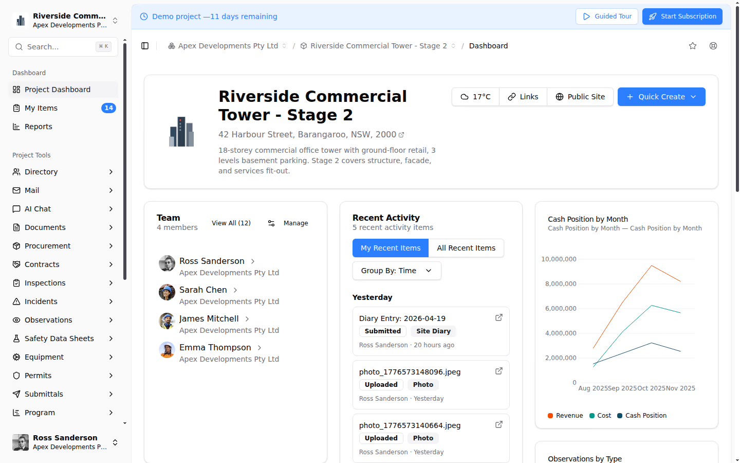
How Teralo's Dashboard Works
Teralo's Intelligence module provides a configurable project dashboard designed for construction projects.
Configurable KPI Cards
Build your dashboard from pre-built KPI cards covering safety scores, contract health, schedule progress, and team activity. Each card is configurable: choose the metric, set thresholds, and define the visualisation. Drag and drop cards to arrange the layout that works for your project.
Real-Time Data
Dashboard metrics in Teralo are calculated from live project data. When an inspection is completed, the inspection pass rate updates. When a progress claim is certified, the commercial metrics refresh. There is no manual data entry for the dashboard; it pulls from the systems your team already uses.
AI Chat
Beyond static dashboards, Teralo's AI Chat lets you ask questions about your project in natural language. "What is our current LTIFR?" "Which contracts have unapproved variations over $50,000?" "Show me the inspection pass rate trend for the last three months." The AI queries your project data and returns answers grounded in your actual records.
Custom Reports
When the dashboard raises a question that needs deeper analysis, generate custom reports across financial, safety, and progress data with flexible filters. Export to PDF, Excel, or CSV for stakeholder distribution or regulatory reporting.
Common Dashboard Mistakes
- Too many metrics: if you cannot explain every metric on the dashboard in one sentence, you have too many
- No targets: metrics without targets are just numbers; define what "good" looks like for each KPI
- Manual data entry: if someone has to manually update the dashboard, it will be out of date within days
- No action linkage: a red metric should trigger a defined management response; if it just turns red and stays red, the dashboard is decorative
- One-size-fits-all: the project director needs a different view than the site supervisor; allow role-based dashboard configurations
Conclusion
A project dashboard that drives decisions is built on live data, focused metrics, clear thresholds, and direct linkage to management actions. A platform like Teralo provides the integrated data foundation and configurable dashboard interface that transforms project reporting from a periodic chore into a continuous management tool.